Recess
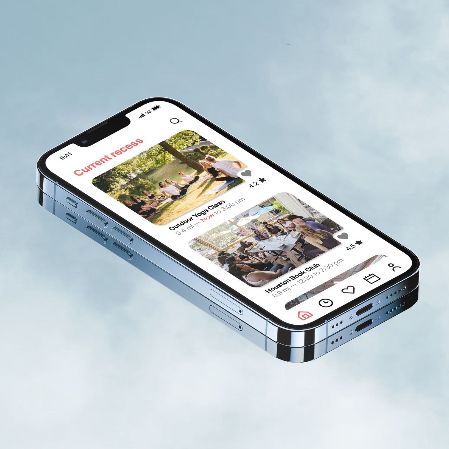
Recess enhances work-life balance with personalized experiences based on your interests, location, and schedule. Say goodbye to doom-scrolling and embrace a joyful, fulfilling lifestyle.
ROLE
UI/UX Designer
TIMELINE
2022 Nov;
72 Hours
Skip to Prototype
INTRODUCTION
A design-a-thon with 160 participants, 72 hours, and 1 solution
Rice Design-a-thon: Level Up! is a three-day, nation-wide event that challenges students to use design thinking skills and collaboration to provide a solution to a modern-day problem. Students will create a prototype of an app or website that addresses a specific problem in their community.
PROMPT:HEALTH& LIFESTYLE
Making changes to improve your health can lead to benefits for your body, your mind, and even the environment. Design a mobile or web application that encourages practices of a healthy lifestyle.
PROBLEM STATEMENT
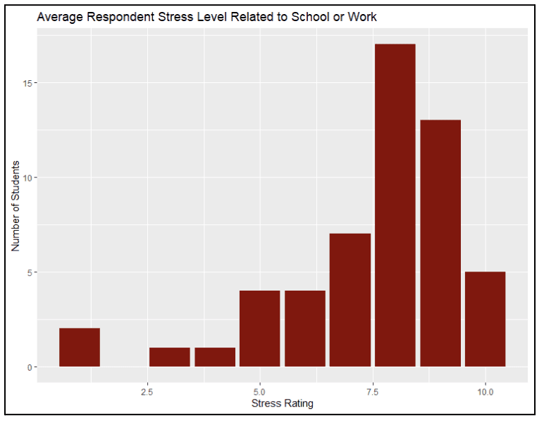
College students overly stressed due to societal expectations
With rising societal short-term expectations in both academic and corporate spheres, we often find ourselves and constantly packing our days with school/work-related events, struggling to maintain a healthy work-life balance.
One leading cause we’ve identified that contributes to this issue is that many find it difficult to effectively manage their free time and breaks in fulfilling ways, often leading to monotonous day-to-day cycles and a poorer, less varied work-life balance. We decided it would be practical and innovative to design a tool that helps users to easily capitalize on their free time to develop healthier lifestyles with more variety.
INTERVIEW QUOTES
"I find it hard to get started or even fit hobbies into my schedule."
"I feel like my work-life ratio is unbalanced and causes a lot of stress."
QUALITATIVE + QUANTITATIVE RESEARCH
Lack of time spent on personal activities
PAIN POINTS & SOLUTIONS
Summary of pain points & solutions
PAIN POINTS
Hard to keep track of goals
Long work hours, limited free time
Stressed from school/work
SOLUTIONS
Goal tracker
Encourage activities
Personal reflection
KEY TAKEAWAYS
Users struggle with their personal freedom due to an inability to keep track of goals as well as long working hours
COMPETITOR AUDIT
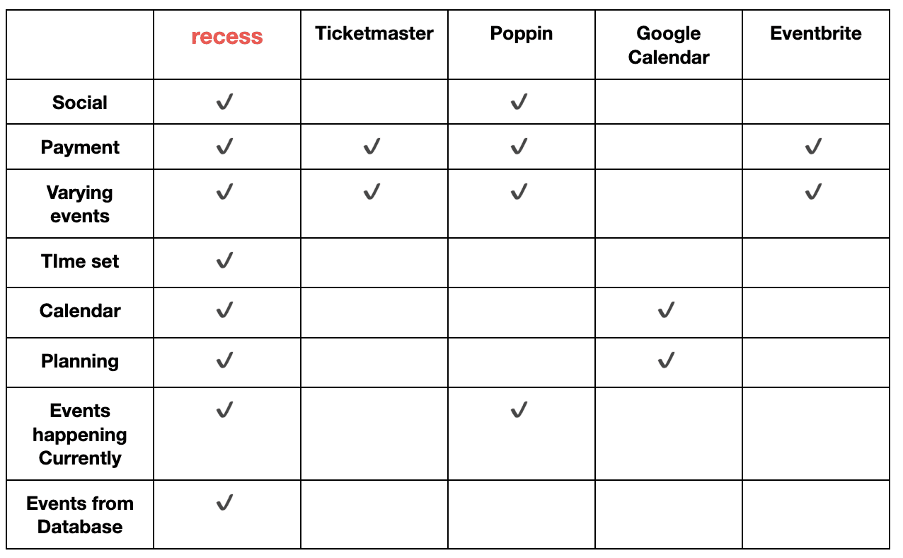
What makes Recess different?
Our team analyzed our product's characteristics in comparison to other similar products available, ensuring we address the requirements users previously couldn't access.
*Poppin is an innovative party app designed for college students to sign up for parties.
FEATURE PRIORITIZATION MATRIX
Implementing features based on value and effort
By listing all the features this app could include, we ranked them on a map to determine their effort levels and value to the user. Due to the 72 hour time restriction, we prioritized implementing high-value low-effort features such as the current/future recess explore page, profile page, and event detail pages.
FEATURE 01
Current & future recess explore
Two explore pages to show users immediate vs future events that are around them.
FEATURE 02
Event details
Provides the user with a holistic overview of the event including time/date, location, popularity, reviews…etc
FEATURE 03
User Profile
Personalizes the user experience while keeping track of what events they have attended and may be interested in.
LOW FIDELITY PROTOTYPE
Testing the wire-flow functionality
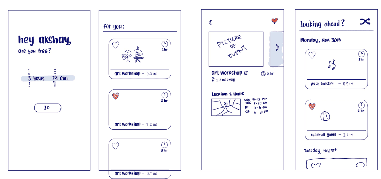
With the key features in mind, we developed the wireframes to establish the fundamental structure of the application before proceeding with the visual design phase. This systematic approach allowed us to verify the seamless implementation of all planned features and functionalities.
Low-fi sketches
INTERFACE DESIGN
Minimalistic and contemporary
TYPOGRAPHY
Inter

COLOR PALETTE
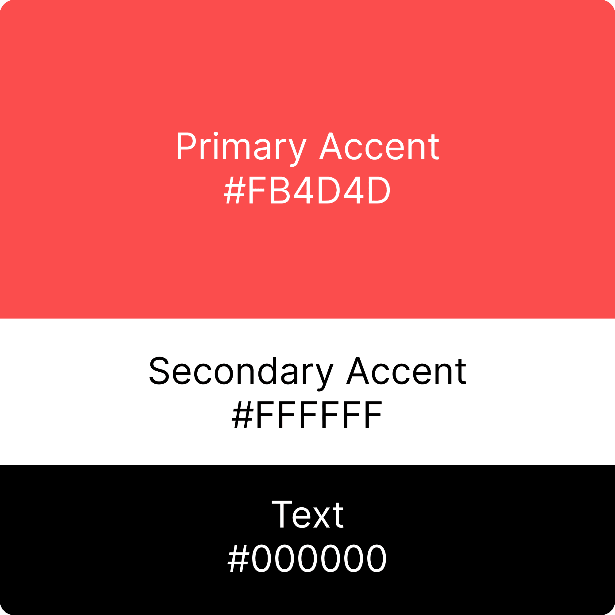
School bell Red
To add a touch of vibrance, we selected a primary accent color, red. It's a playful and vibrant choice, reminiscent of the joyful moments when children come together to have fun and explore.
LOGO & AESTHETIC
Riiiiiiing!
The overall visual style reflects minimalism, trendiness, and familiarity, to ensure the app's design emphasized the users and their potential for joy and fulfillment through its recess opportunities. The logo is a school bell to match the theme of 'recess time' that is associated with childhood.
FINAL PRODUCT
HIGH FIDELITY PROTOTYPE
Functional prototype
INTERACTIVE FIGMA PROTOTYPE
Try it out for yourself!
REFLECTION
Learnings and challenges
LEARNING
Communication is key
As it was our first time working together as a team, we had to divide and conquer to complete all design-a-thon elements. Immediately after discussing our product idea, we listed all the necessary elements ranging from research to prototyping. This list allowed us to create a schedule, stay on track throughout the event, and successfully produce recess.
CHALLENGE
Acknowledging limitations
With a time restriction of 72 hours, we were constrained on how many features we could feasibly implement into the prototype. Thus, by utilizing a feature prioritization matrix, we could decide on essential parts of the product as a team. It is important to know what we are working with to maximize our time and efforts.
REFLEECTION
Take Risks
This was my first time participating in a design-a-thon, and we were very pleased to place 2nd place out of 160 teams (480 participants). Going into the design-a-thon, I did not know what to expect, but our efforts were rewarded by giving it our best shot. It pushed me out of my comfort zone to be curious, try new things, and take every opportunity. In the future, I will definitely participate in similar events to gain more experience!
